Islamabad Talks Logo: The Visual Diplomacy of the 2026 Summit
Islamabad Talks Logo elements have officially been unveiled, capturing the intense geopolitical gravity of the April 2026 United States-Iran negotiations. As the world watches Pakistan host the most consequential diplomatic summit in modern Middle Eastern history, the visual branding of this event has sparked immense interest among analysts, statecraft experts, and graphic designers alike. When global powers convene to bridge unprecedented divides following the catastrophic February 28 escalations, every single detail is meticulously scrutinized—down to the very emblem that marks the negotiation tables inside the heavily fortified Red Zone. The creation of such a powerful visual identity is never an afterthought; rather, it represents a calculated maneuver in the realm of visual diplomacy, designed to subconsciously influence the tone, trajectory, and overarching narrative of the high-stakes dialogue. The official branding goes beyond mere aesthetics, serving as a beacon of cautious optimism in a region deeply scarred by recent hostilities. In this comprehensive analysis, we will deconstruct the profound symbolism woven into the summit’s official design, exploring how color theory, typography, and cultural iconography converge to project neutrality and foster a fragile environment of mutual respect.
Unveiling the 2026 Peace Summit Emblem
The highly anticipated release of the official insignia occurred just days before delegations were scheduled to arrive in Pakistan’s capital. Displayed prominently across digital billboards throughout the diplomatic enclave and on the official letterheads of the Ministry of Foreign Affairs, the emblem instantly became the visual anchor for the historic proceedings. Hosting such a monumental event requires not only airtight security measures—evidenced by the massive deployment of rangers and military personnel—but also a flawless execution of soft power. The emblem was officially projected onto the facade of the Serena Hotel, the designated sanctuary for the diplomatic corps. This strategic unveiling was heavily covered by international media, signaling to the global community that Pakistan was fully prepared to facilitate dialogue. The sheer scale of the projection, combined with the solemnity of the occasion, underscored the weight of the moment. Observers noted that the design seamlessly integrated modern minimalist trends with deeply rooted regional aesthetics, reflecting an awareness of the contemporary geopolitical landscape while honoring the cultural heritage of the host nation. The careful orchestration of this reveal highlights how modern diplomacy relies on robust branding to communicate stability and competence before a single word of negotiation is ever spoken.
The Geopolitical Context of the April 2026 Summit
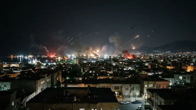
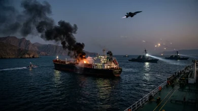
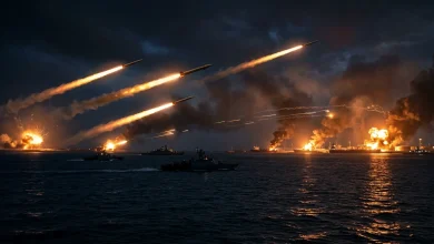
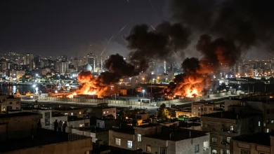
Understanding the gravity of the logo requires a deep dive into the harrowing events that necessitated these negotiations. The summit follows a devastating escalation of violence, marked by the targeted strikes that tragically claimed the lives of thousands, including top-tier leadership. This unprecedented conflict sent shockwaves through the global economy, abruptly halting energy shipments through the Strait of Hormuz and triggering a massive spike in oil prices worldwide. Against this volatile backdrop, the necessity for a negotiated settlement became an urgent global priority. Pakistan’s successful brokering of a 14-day ceasefire provided a narrow window of opportunity for peace, a fragile pause in hostilities that is intimately tied to the broader Iran-Israel war ceasefire frameworks currently being debated. The immense pressure to convert this temporary truce into a permanent resolution is palpable, and the summit’s branding must reflect this solemn reality. There is no room for triumphalism or aggressive posturing in the visual messaging; instead, the design must embody restraint, reflection, and an unwavering commitment to diplomatic engagement. The stakes could not be higher, and the emblem serves as a constant reminder to the delegates of the monumental responsibility they bear as they navigate this treacherous geopolitical minefield.
Visual Diplomacy: Dissecting the Elements
Visual diplomacy is a specialized subfield of international relations where graphic design, architectural spatial arrangements, and sartorial choices converge to send powerful non-verbal messages. In the context of the Islamabad negotiations, the logo is a masterclass in this discipline. Every vector, curve, and shade has been endlessly debated and refined by a consortium of communication experts and diplomatic liaisons. The goal was to create an image that is entirely devoid of provocation. In an environment where the IRGC declares U.S. and Israeli universities as targets, signaling severe ideological polarization, the official branding must transcend bilateral animosities. The chosen emblem relies on universally understood symbols of dialogue and continuity. Soft, sweeping lines replace any sharp angles that could be unconsciously interpreted as aggressive or confrontational. The circular motifs dominant in the design speak to the cyclical nature of dialogue—an endless loop of speaking, listening, and compromising. By breaking down the visual components, we can see a deliberate attempt to engineer an atmosphere of parity, where neither the American delegation nor the Iranian counterparts feel visually subordinated. This level of psychological engineering is essential when the physical negotiation rooms themselves have been strictly arranged to ensure absolute symmetry.
Color Palette: Balancing Neutrality and Tradition
The selection of the color palette was perhaps the most rigorously vetted aspect of the entire design process. Designers actively avoided colors heavily associated with the national flags of the primary conflicting parties to prevent any perception of bias. Red, a color universally linked to both danger and the recent bloodshed, was strictly banned from the official branding guidelines. Instead, the primary hue is a muted azure blue, a color historically utilized by international peacekeeping bodies to evoke tranquility, vastness, and stability. This is complemented by subtle accents of olive green, an ancient and culturally transcendent symbol of peace and reconciliation. The use of stark white in the negative space of the design offers a visual representation of a clean slate—a vital psychological cue for nations attempting to rewrite their contentious history. The deliberate avoidance of aggressive tones serves to lower the visual temperature of the event, providing a calming backdrop against the inherently stressful environment of high-stakes geopolitical bargaining.
Typography and Cultural Duality
Typography in diplomatic design is fraught with political implications. For the Islamabad summit, the design team implemented a strict policy of typographic equality. The official title of the event is rendered in both English and Persian, ensuring that neither language dominates the visual hierarchy. The English text utilizes a modern, sleek sans-serif font that communicates efficiency, transparency, and forward-looking pragmatism. Conversely, the Persian text is elegantly rendered in a contemporary Nasta’liq-inspired script, honoring the rich literary and cultural traditions of the region without appearing overly archaic. The kerning and leading of both scripts were mathematically balanced so that their optical weight is identical. This meticulous attention to typographic parity is a direct reflection of the diplomatic requirement for mutual respect. It visually reinforces the fundamental premise of the summit: that both nations are sitting at the table as equal sovereign entities, despite the profound asymmetries in their military and economic power. Such details may seem minor to the layperson, but in the hypersensitive world of international negotiations, they are critical components of the diplomatic framework.
The Strategic Role of Graphic Design in Statecraft
The utilization of graphic design in statecraft is not a novel concept, but its importance has magnified exponentially in the digital age, where images are instantly broadcast to global audiences. Historically, major peace treaties and summits have relied on distinct visual identities to cement their legacy in the public consciousness. The branding of this event shares a lineage with the sophisticated visual strategies employed during the Camp David Accords or the Geneva conventions, albeit updated for the 24-hour news cycle. A well-crafted emblem can help to legitimize the proceedings, lending an air of officialdom and permanence to what is, in reality, a highly precarious and fluid situation. As seen during the recent Meloni Middle East tour, where visual optics were carefully managed to project European influence, the Islamabad emblem is tasked with projecting Pakistan’s ascendant role as a capable and trustworthy mediator. The design must communicate to both domestic and international audiences that the host nation possesses the institutional maturity and diplomatic sophistication required to manage a crisis of this magnitude.
Symbolism of the Ceasefire Intermediary
While the primary focus remains on the United States and Iran, the logo subtly but powerfully acknowledges Pakistan’s indispensable role as the host and intermediary. Woven into the background of the primary circular motif is a faint, abstracted silhouette of the Margalla Hills, the iconic geographic feature that overlooks the capital city. This inclusion roots the event in its physical geography without overwhelming the central message of bilateral dialogue. Furthermore, a highly stylized representation of the Jasmine flower, Pakistan’s national symbol, forms the central vertex where the two interlocking rings meet. This signifies that Pakistan is the vital connective tissue holding the fragile peace process together. It is a masterful stroke of design, allowing the host nation to assert its presence and claim diplomatic credit while maintaining the requisite humility expected of an impartial mediator. The design beautifully captures the essence of Pakistan’s diplomatic tightrope walk, balancing regional alliances with global peacekeeping responsibilities.
| Design Element | Symbolic Representation | Diplomatic Significance |
|---|---|---|
| Azure Blue Background | Tranquility and Global Peace | Sets a neutral tone, stepping away from militaristic colors associated with the recent 39-day conflict. |
| Interlocking Geometric Rings | Dialogue and Continuity | Represents the ongoing, cyclical effort to bridge the deep divides between Washington and Tehran. |
| Margalla Hills Silhouette | The Host City | Subtly honors Pakistan’s vital mediation role without overshadowing the primary negotiating parties. |
| Dual Typography | Equality and Mutual Respect | Utilizes equal optical weighting for both English and Persian scripts to ensure perceived parity. |
| Jasmine Motif Axis | Mediation and Facilitation | Positions the host nation as the essential connective element holding the fragile peace process together. |
The Making of the Design
The creation of this emblem was a highly classified operation, shrouded in as much secrecy as the negotiation protocols themselves. The task was entrusted to a select committee composed of top-tier designers from the National College of Arts, working in tandem with communication strategists from the Ministry of Foreign Affairs. Operating under strict non-disclosure agreements, the team was given a formidable brief: design an identity that offends no one, inspires confidence, and captures the historical weight of the moment. The iterative process involved dozens of rejected concepts. Some initial drafts were deemed too modern, risking a perceived lack of gravitas, while others were considered too deeply entrenched in Islamic geometry, which might alienate the secular elements of the Western delegations. The final iteration was a triumph of compromise, carefully vetted by psychological operations experts to ensure no hidden meanings could be misconstrued or weaponized by dissenting factions. The sheer logistical effort behind the design underscores the reality that in modern diplomacy, visual communication is treated with the same rigorous scrutiny as national security policy.
Collaborative Efforts in a High-Stakes Environment
Before the logo could be officially minted, it had to undergo a unique back-channel approval process involving the advance teams of both participating nations. This unprecedented step was necessary to prevent any visual missteps that could derail the talks before they even began. Drafts were quietly circulated to liaisons in Oman and Switzerland—nations that had previously facilitated indirect communications. The feedback loop was intense, with minor adjustments demanded regarding the exact shade of blue and the curvature of the interlocking rings. This collaborative, albeit highly guarded, effort effectively became the first successful micro-negotiation of the entire summit. By reaching a consensus on the visual branding, the delegations demonstrated a foundational willingness to cooperate on shared objectives. It set a subtle precedent of agreement, a vital psychological victory that organizers hope will bleed into the substantive policy discussions regarding nuclear infrastructure and sanctions relief.
Global Reception and Media Interpretation
Upon its public release, the emblem was immediately dissected by global media outlets and political commentators. News networks utilized the logo as the central graphic for their rolling coverage, embedding it into the minds of millions of viewers worldwide. The reception has been overwhelmingly positive, with design critics praising its elegant simplicity and diplomatic analysts noting its soothing psychological effect. According to detailed international reporting by Reuters, the visual identity has successfully established a narrative of serious, professional diplomacy, contrasting sharply with the chaotic imagery of the preceding war. However, the logo is not without its detractors. Hardline factions on both sides of the conflict have criticized the emblem, arguing that its peaceful aesthetics mask the brutal realities of the geopolitical struggle. Nevertheless, the dominant narrative remains one of cautious hope, heavily reinforced by the disciplined and unified visual messaging engineered by the host nation.
Navigating Sensitivities in Middle Eastern Conflicts
Designing for a conflict of this magnitude requires navigating a labyrinth of cultural, religious, and political sensitivities. The creators of the emblem had to be acutely aware of regional dynamics, especially considering that Bahrain protests escalate regularly in response to perceived slights in regional diplomacy. Any visual element that could be interpreted as favoring a specific sectarian or nationalistic narrative was ruthlessly excised. The design deliberately avoids any overt religious iconography, opting instead for secular symbols of peace and dialogue. This was a critical decision aimed at maintaining the secular legitimacy of the talks on the international stage, while still respecting the cultural context of the participating nations. The ability to thread this needle is a testament to the sophisticated understanding of semiotics possessed by the design team. By prioritizing universalism over particularism, the emblem successfully creates a safe visual space where deeply entrenched adversaries can engage in the difficult work of peacemaking.
Looking Ahead: Can a Symbol Bind a Truce?
Ultimately, a logo cannot draft a treaty, enforce a ceasefire, or erase decades of deep-seated animosity. The true test of the Islamabad summit will be determined by the political will of the delegates seated around the table, not the design printed on their dossiers. However, it would be a mistake to underestimate the power of visual diplomacy in shaping the environment in which those decisions are made. The emblem serves as a constant, silent mediator, urging restraint and reminding all participants of the global desire for a peaceful resolution. As the world waits with bated breath for the outcome of the 2026 negotiations, the official branding stands as a beacon of diplomatic potential. Whether the summit results in a historic breakthrough or a disappointing stalemate, the visual identity of the event has already secured its place in the annals of statecraft. It proves that even in the darkest hours of conflict, the human desire for order, dialogue, and aesthetic harmony remains a powerful force for unity.