WhatsApp Liquid Glass Feature: Complete 2026 UI Redesign Guide
WhatsApp Liquid Glass is fundamentally redefining the user experience for billions of users worldwide as Meta rolls out its most ambitious design overhaul in the platform’s history. As of late March 2026, the messaging giant has moved past closed beta testing to introduce a highly sophisticated, translucent visual architecture initially inspired by Apple’s iOS 26 design language. This radical shift moves away from the flat, utilitarian interface of previous iterations, favoring a dynamic, floating ecosystem that maximizes screen real estate, depth, and user engagement. With a specific focus on the revamped voice note player, a 5-second rewind feature, and a floating chat bar, the new interface is actively reshaping modern communication standards.
The Evolution of Meta’s UI Strategy
The journey toward a completely modernized aesthetic did not happen overnight. For years, the platform maintained a highly conservative approach to interface changes, prioritizing functional reliability across a vast array of low-end and high-end devices over visual flair. However, the rapidly changing ecosystem of smartphone operating systems pushed Meta into a corner where adaptation became absolutely necessary. Facing intense pressures from competing platforms and rapidly evolving user expectations, the developer teams initiated an overarching visual overhaul that aligns seamlessly with modern mobile environments. The current deployment acts as a profound testament to the fact that everyday chat applications can be both functionally robust and visually mesmerizing without compromising on performance.
By leveraging translucent backgrounds, reflective surfaces, and adaptive color palettes that instantly shift depending on native dark mode or light mode settings, the application now feels less like an isolated, static utility and more like a fluid, deeply integrated extension of the phone’s native operating system. It is this strategic hardware-software alignment that places the app back at the absolute forefront of user interface design, signaling a definitive departure from the conservative updates of the past decade. For related insights on Meta’s legal and strategic positioning this year, you can explore the comprehensive coverage on the Meta social media addiction trial 2026.
Decoding the iOS 26 Integration Process
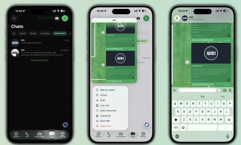
Apple’s iOS 26 has successfully championed the concept of spatial computing and layered user interfaces on mainstream mobile devices. Meta’s direct response to this paradigm shift is an adoption that integrates these core philosophies deep into the messaging app’s source code. When navigating through the freshly updated app, users will immediately notice the newly designed semi-transparent bottom navigation bar. It has been completely re-engineered to create a profound sense of depth and layering, featuring a subtle, adaptive blur directly behind the content.
Each icon situated on this floating navigation bar now responds with buttery-smooth, haptic-enabled animations when tapped, giving an interactive and highly tactile feel to routine actions. Furthermore, legacy context menus and even the previously basic system keyboard have been upgraded to match this reflective, glass-like aesthetic. The design intentionally ensures that as users furiously scroll through long, media-heavy chat threads, the background content subtly peeks through the UI elements, seamlessly maintaining an unbroken visual context.
Translucent Voice Note Player Redesign
One of the indisputable crown jewels of this update is the completely revamped voice note player. In previous app builds, navigating away from an active chat while a voice note was playing would summon a rather obtrusive, solid green bar anchored at the top of the screen. The new 2026 architecture replaces this outdated element with a floating, highly sophisticated widget. According to documented reports from elite beta testing communities, the new playback bar distinctly features the sender’s profile picture on the far left side, instantly providing crucial visual context for the audio currently being consumed.
Moreover, the progress of the voice message is no longer constrained to a traditional, boring linear progress bar. Instead, the developers have mapped it to be displayed in a circular pattern that organically wraps around the shape of the sender’s profile picture. This dynamic, shape-matching reaction to playback progress makes passive interactions feel responsive, modern, and deeply immersive.
The 5-Second Rewind Mechanics
Moving beyond pure aesthetics, major functional upgrades form a massive, foundational pillar of this specific release. A highly requested, community-driven feature has finally made its long-awaited debut: the 5-second rewind button. Located organically within the new translucent voice player widget, this functionality allows users to jump back exactly five seconds with a single, simple tap. For individuals frequently listening to lengthy, complex voice memos—often running into several minutes—this totally eliminates the notoriously frustrating experience of manually scrubbing a tiny progress bar to catch a missed word or specific detail.
This unprecedented level of precision control highlights Meta’s dual-pronged focus: actively creating a beautiful interface that simultaneously solves genuine, documented user pain points. It is a brilliant paradigm shift that turns audio notes from a cumbersome, linear communication method into a highly manageable, podcast-like micro-listening experience.
Rollout in the Business Application Ecosystem
The visual overhaul is not strictly limited to everyday consumer accounts. Meta has intelligently begun rolling out these sweeping translucent UI changes to the Business version of the application as well. Enterprise users and small business owners can now interact with clients using the refreshed, layered interface, which adds a distinct touch of professionalism and modernity to corporate communications. The integration of these advanced graphic systems into the commercial side of the platform indicates that the company trusts the stability of the new rendering engine enough to deploy it where financial transactions and critical client management take place.
Legacy Interface vs. New UI Design
To fully grasp the massive magnitude of this update, it is crucial to directly compare the outgoing flat design language with the brand-new spatial design framework. The data table below clearly outlines the primary technical and visual shifts taking place across the platform.
| Feature / Component | Legacy Interface (Pre-2026) | New 2026 Architecture |
|---|---|---|
| Voice Note Playback | Solid green top bar, linear progress, global chat pause | Floating widget, circular progress around profile picture |
| Audio Controls | Play/Pause only, manual slider scrubbing | Dedicated 5-second rewind button, tactile haptic feedback |
| Chat Input Bar | Fixed block firmly anchored to the bottom of the screen | Detached, floating component with depth and fluidity |
| Bottom Navigation | Opaque background, static, rigid icons | Semi-transparent, adaptive blur, smooth interaction animations |
| System Keyboard | Standard flat color matching the basic theme | Reflective, glass-like surfaces interacting with background media |
The Impact on Cross-Platform Synergy
While the initial visual overhaul is predominantly making massive waves within the Apple ecosystem due to its native API integrations, the long-term implications for cross-platform harmony are immense. The global technology sphere is continually, aggressively moving toward unified software experiences, regardless of the underlying hardware a consumer chooses. By rapidly pushing the boundaries on iOS, Meta is inadvertently raising the bar for its Android counterpart. Interestingly, the underlying framework allowing for these complex graphical renderings is purposefully designed to be highly scalable across varying screen sizes and processor capabilities.
As intelligent AI tools become deeply embedded into our daily software workflows—similar to the disruptive transformations we are actively witnessing with the ChatGPT 2026 AI revolution—the graphical user interface must absolutely be capable of supporting dynamic visual overlays, AI-generated conversation summaries, and real-time visual language translations without stuttering or crashing.
Android Equivalents and Design Parity
Android users are certainly not being left entirely in the dark during this transition. While the exact branding of this UI is deeply tied to Apple’s distinct design philosophy, Meta is actively, simultaneously developing a parallel design language using the most advanced, fluid elements of Android’s Material You engine. The ultimate goal is pure cross-platform parity. When users eventually switch devices—a process that was recently made drastically easier with native Wi-Fi cross-platform chat transfer tools—they should never feel like they are stepping backward in visual time. Users deeply interested in the bleeding edge of Android interface developments can also look into the Samsung One UI 8.5 Beta release guide for a clear glimpse of exactly where the broader Android ecosystem is heading visually this year.
Security, Privacy, and Performance Trade-offs
An interface graphical update of this sheer magnitude inevitably sparks loud conversations regarding deep software optimization. Continuous translucency, real-time background blurring, and constant circular progress tracking require significantly more GPU horsepower than rendering static, opaque blocks of flat color. Meta software engineers have reportedly rewritten massive portions of the underlying app rendering pipeline to actively ensure that these new aesthetic layers do not quickly turn older generation smartphones into sluggish, overheated bricks.
Simultaneously, Meta is rigorously testing next-generation “Private Processing” technology behind the scenes. As part of the broader 2026 feature update cycle, the application will soon effortlessly generate highly secure, AI-powered private summaries of unread conversations right from the main chat list. This vital, third-party audited technology securely ensures that these summaries are generated completely within an isolated device environment, strictly preventing Meta from ever accessing the raw, decrypted data. The new floating interface brilliantly accommodates these upcoming AI summaries seamlessly, natively utilizing the layered spatial design to present priority contextual information without visually overwhelming the primary, traditional chat view.
Will Advanced UI Drain Battery?
One of the most vocal, persistent concerns among early beta testers has been the potential impact on daily battery life. Rendering frosted glass effects dynamically over moving high-definition video or rapidly scrolling text is undeniably a computationally expensive processing task. However, by deeply, natively integrating with the core operating system APIs rather than stubbornly relying on sluggish custom-built rendering engines, the overall impact on battery life has been surprisingly minimized. The intelligent software system dynamically scales back the frame rate of non-essential animations and drastically reduces the computational intensity of the blur effects when the device automatically enters low power mode, clearly demonstrating a highly sophisticated awareness of the host hardware’s real-time power status.
Beta Tester Feedback and Community Reactions
Since the feature first appeared in closed testing rings, the community reaction has been overwhelmingly positive, albeit with minor constructive critiques regarding icon spacing. Beta testers have widely praised the floating chat bar for drastically improving ergonomic typing on larger displays, such as the Pro Max iPhone variants. The detachment of the input bar from the rigid bottom bezel effectively raises the keyboard to a more natural thumb-resting position, significantly reducing typing fatigue during extended chat sessions. This nuanced ergonomic improvement proves that the redesign is not merely superficial but fundamentally enhances how human hands interact with digital interfaces.
The Road Ahead for WhatsApp Users in 2026
The global roll-out of this massive, unprecedented visual update is being expertly executed in highly strategic, measured phases. Initially spotted cautiously in the Business app and specific high-tier beta rings, the meticulous deployment strategy is heavily calculated to carefully monitor crash rates and isolated UI glitches across thousands of distinctly different device configurations. By the end of the second operational quarter of 2026, it is confidently anticipated that the vast majority of the active user base will have successfully transitioned to the new graphical architecture.
As the invisible line separating mobile applications and robust desktop-class software continues to blur into non-existence, modern messaging platforms must rapidly evolve into comprehensive, visually stunning communication hubs. This update definitively proves that Meta is absolutely not content with simply maintaining lazy market dominance; they are aggressively, actively working to completely redefine the aesthetic and functional gold standards of the entire industry. For developers, designers, and tech enthusiasts desperately wanting to closely follow official developer channel updates and deeper technical documentation, you can easily visit WABetaInfo’s tracker for continuous, highly granular patch notes.
Ultimately, this robust feature set is a monumental triumph of modern software design architecture. It seamlessly marries the deeply requested, highly practical features—like the 5-second voice note rewind and significantly enhanced onboard storage management—with a breathtaking visual wrapper that feels entirely right at home on the absolute latest flagship devices. The outdated era of the flat, boring, utilitarian chat application is officially over, permanently replaced by a fluid, spatial, and exceptionally intuitive digital environment.